Lighting Insights
2700K vs. 3000K: Which Is Right for Your Home?
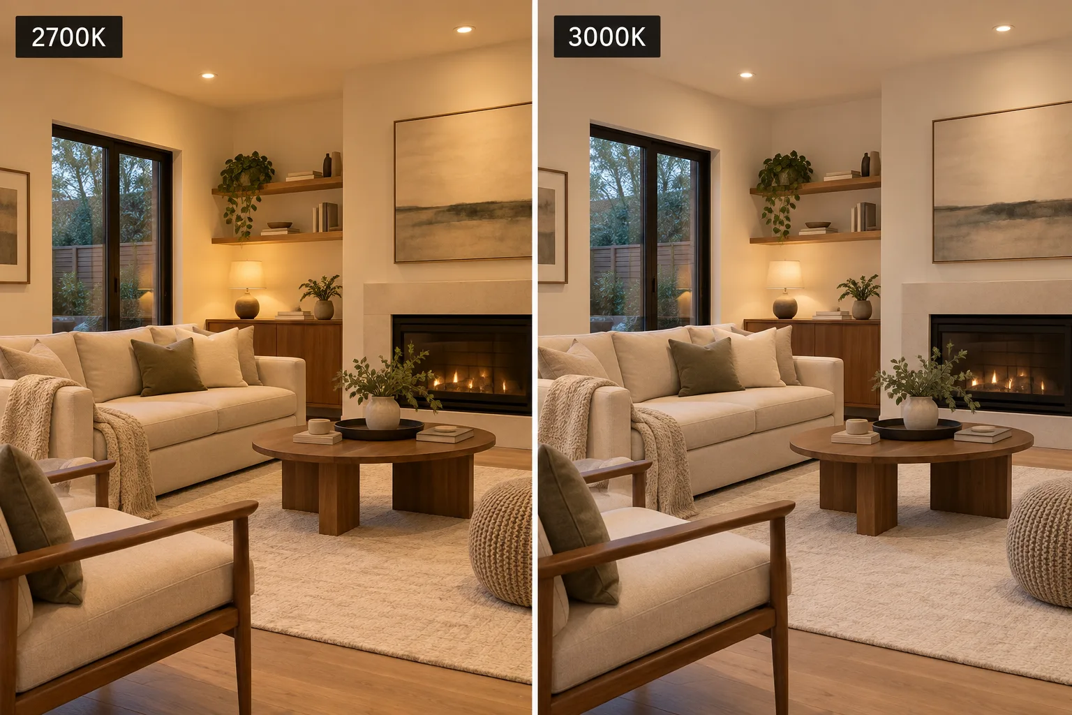
If you're choosing LED lighting for your home, 2700K and 3000K can look almost interchangeable on a specification sheet. Both are warm-white light, and only 300 kelvin separates them. Put them in the same room, though, and the difference is easier to see. 2700K has the warmer, slightly golden appearance many people associate with traditional incandescent bulbs. 3000K is still warm, but it looks a little cleaner and more neutral.
The difference becomes important when the light hits the room around it. White cabinets can look warmer under 2700K. Wood can appear richer. Pale stone and gray finishes may look more neutral under 3000K. Even a wall color you spent days choosing can look different after the sun goes down and your electric lighting takes over.
So the useful question isn't simply whether 2700K or 3000K is “better.” It's which one works better with your home and the way you want the room to feel.
Why 2700K Feels Familiar
There's a reason 2700K often looks immediately comfortable in a home. Its appearance is close to the warm light produced by the incandescent bulbs that dominated residential lighting for decades. The U.S. Department of Energy places 2700K at the warm end of the common residential range and associates it with the familiar appearance of incandescent lighting.
That warmth works particularly well with materials that already have warm undertones. Natural and stained wood, cream paint, brown leather, warmer fabrics and brass or bronze finishes can all benefit from it. In a living room or bedroom used mostly in the evening, 2700K can also create the softer atmosphere many people expect when they turn the lights down at the end of the day.
But warmth affects everything in the room, not just the things you want to emphasize. A bright white cabinet, white wall or pale quartz countertop can pick up some of that warmer character too. If you've carefully selected a crisp white finish, you may find that 2700K makes it look creamier than you expected.
That's where 3000K becomes interesting.
What Changes at 3000K?
Moving from 2700K to 3000K doesn't suddenly make the lighting cool. 3000K is still very much a warm residential white. It simply pulls back some of the yellow-gold appearance.
That relatively small change can make whites look cleaner and help neutral finishes retain more of their original character. It's one reason 3000K is frequently appealing in kitchens and bathrooms with white cabinetry, quartz, marble, gray tile or other lighter finishes. You still get warmth, but with less influence on the color of those surfaces.
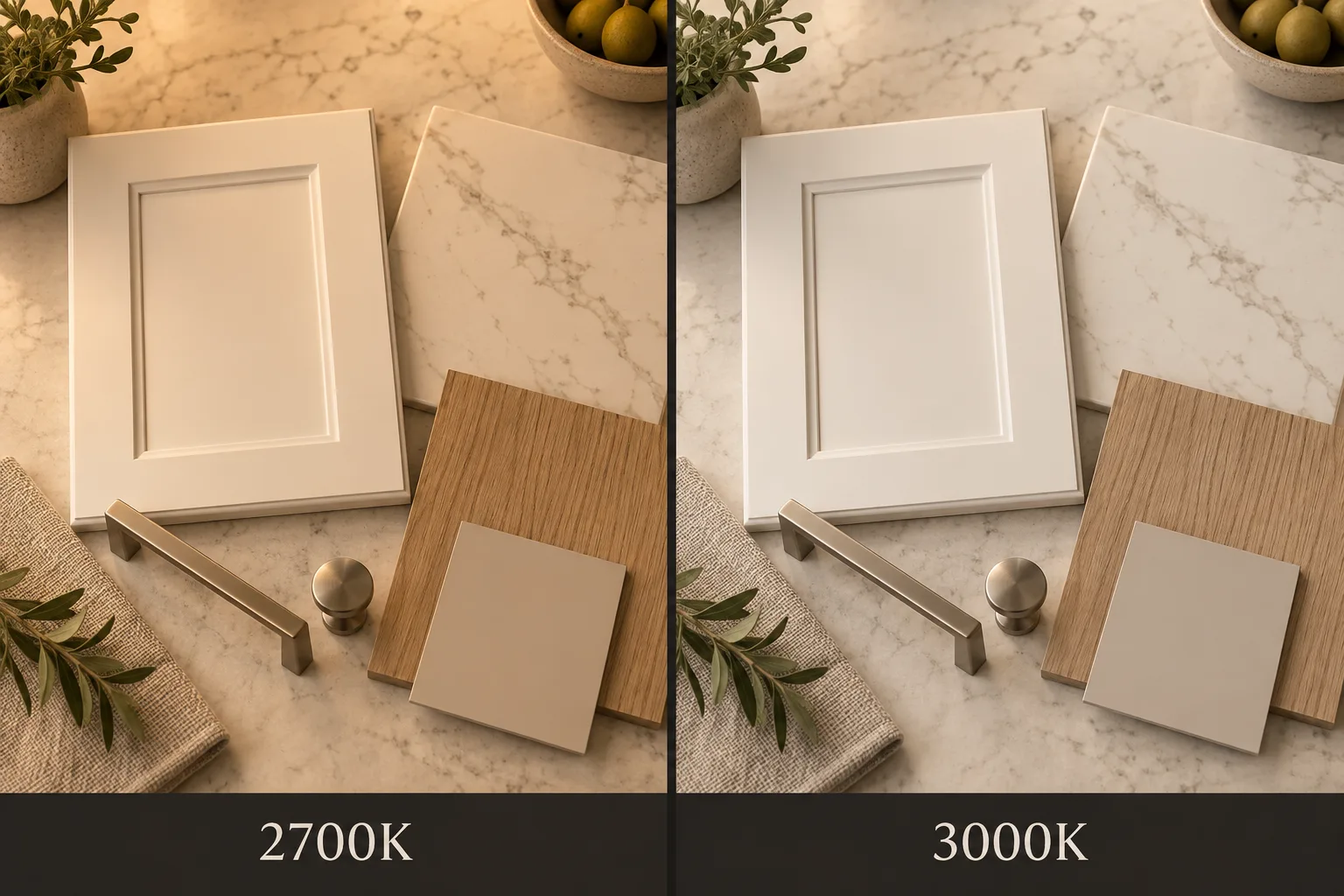
Consider two kitchens. One has walnut cabinets, a warm stone backsplash, oak flooring and aged brass hardware. The other has white cabinets, pale quartz, a gray backsplash and brushed nickel fixtures. Recommending exactly the same color temperature simply because both rooms happen to be kitchens ignores most of what determines how the light will actually look.
The same applies elsewhere in the house. A bedroom with warm wood furniture and cream walls may look excellent at 2700K, while a bedroom with crisp white walls and cooler contemporary finishes may look better to you at 3000K. Room labels are useful starting points, but the finishes in the room are often more important.
Pay Attention to the Light You Already Have
Natural daylight can hide some of the difference between 2700K and 3000K. A kitchen filled with afternoon sun may look good under either one because the electric lighting isn't doing most of the work. The real test comes after sunset.
That's particularly important in rooms you use mostly at night. A dining room may receive beautiful daylight when you're comparing bulbs on Saturday afternoon, but if you normally use the room at 7:30 in the evening, that's when you should judge the lighting.
Rooms with little natural light present the opposite situation. In a windowless bathroom, interior hallway or darker kitchen, the selected color temperature may influence the appearance of the space throughout the day.
You should also look beyond the individual room. Different color temperatures can work perfectly well within the same house, but adjoining spaces deserve some thought. A 2700K living room next to a 3000K kitchen may create a subtle and intentional transition. Mixing 2700K and 3000K fixtures randomly within the same open kitchen, on the other hand, can simply look like someone bought the wrong bulbs.
Don't Choose From a Picture on a Screen
Online photographs are useful for showing the general difference between 2700K and 3000K, but they aren't reliable enough to make the final decision for your home. Cameras adjust white balance, photographs are edited, and your phone or computer screen changes the image again before you see it.
If you're choosing the color temperature for twenty recessed lights, several pendants or a permanent run of under-cabinet lighting, there is a much better test: spend a few dollars and try both in the actual room.
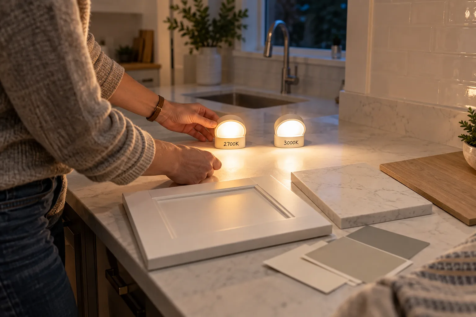
Use comparable 2700K and 3000K products and evaluate them after dark. Then stop looking at the bulbs and look at the room. Check the cabinets and countertops. Look at the wall color and flooring. Sit where you normally sit and see how the room feels. If you're choosing bathroom lighting, look at yourself in the mirror.
You may find that you notice the difference immediately. You may also decide that you like both. Either result is more useful than trying to make the decision from a Kelvin chart.
So, 2700K or 3000K?
If you like the warm, comfortable appearance traditionally associated with incandescent residential lighting, start with 2700K. It's particularly worth considering when the room contains warm woods, creamier colors and finishes that benefit from a little extra warmth.
If you want to keep the room warm but prefer whites and neutral finishes to look somewhat cleaner, start with 3000K. It can be an excellent middle ground for someone who finds 2700K a little too golden but doesn't want the noticeably cooler appearance of higher color temperatures.
And you don't have to choose one color temperature for the entire house. A home can use 2700K in some spaces and 3000K in others without looking inconsistent. What matters is how those spaces relate to each other and whether the changes look intentional.
The numbers make 2700K and 3000K sound more technical than the decision really needs to be. Think about the room, not just the bulb. Look at the finishes you already have, consider when and how you use the space, and compare the two temperatures under real conditions before committing to permanent fixtures.
A 300-kelvin difference isn't enormous. But when that light is falling across every surface in a room, it can be enough to make one choice feel noticeably better than the other.
Sources
U.S. Department of Energy — Energy-Efficient Light Bulbs
Guidance on LED color temperature and common residential color-temperature ranges.
Illuminating Engineering Society (IES) — Correlated Color Temperature (CCT)
Lighting-industry reference for correlated color temperature and its use in describing the appearance of white light.